
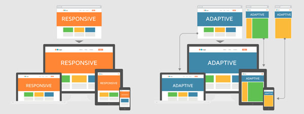
A responsive web design, commonly known as RWD, is a relatively new approach in rendering a web design as we know it. This new method of RWD presentation aims to craft websites in such a manner that they provide an optimal viewing experience for all visitors of that particular website using different modes of access no matter such as a conventional desktop computer, a tablet, or via a smart phone. This new platform has eradicated previous loading issues whenever a tablet or smart device is used to access a website. With a RWD website, loading is seamless and quick, thus saving time and generally enhancing the browsing experience.
More than half of today’s online users navigate the Internet via their mobile devices. It is therefore important that websites be developed on a RWD platform to cater to this ever growing number population of online users. These days, it is not uncommon to describe a RWD website as mobile friendly website. The obvious advantages of a mobile friendly website over previous developed for desktop computer monitor browsing only websites include easy access, intuitive navigation, intuitive presentation of webpages and contents, easy to read, and no longer the need to scroll, pan or resize a particular page. This new RWD paradigm provides one’s assess to websites from literally anywhere. Put another way, a RWD website is platformed for optimal browsing experience via myriad smart devices readily available these days.

An Overview Of RWD Trends
Even though Responsive Web Design websites have many useful features to meet the demands of today’s online users, the adoption rate of this platform is still a long way from ideal. Only a fraction of the websites today are properly optimised according to the structures of a RWD platform.
Currently in 2021, a correctly RWD-designed website will automatically adapt its layout depending on the viewing environment (such as tablets or smart phones and the like), by relying on a set of versatile and flexible elements, such as flexible images, CSS3 media queries, as well as fluid grids designed to take the user experience to a desirable level of online navigation.
An expected RWD trend, in the immediate future, is a feature characterised as “Adaptive delivery” meant for adoption by online retail stores.
There is a proliferation of online shops and e-commerce shopping is no longer a quaint experience but instead has become commonplace in the way we shop today. The convenience of our online purchase is undeniable with access to browsing to placing an order with only a touch of a button.
However, and despite this fertile environment for the further growth of online shopping activities, there are still persistent complaints, by mobile and tablet online users, of slow loading and waiting times. A RWD website will address this issue with its adaptive delivery feature designed to speed up loading times and thus enhancing user experience.
How does RWD "adaptive delivery" work?
RWD specialist developers would embed various codes for tablets, desktops and smart phones with each code to specifically and identify the device used for accessing the website in question and instantaneously present the website for optimal viewing.
Website codes utilise a combination of CSS and HTML codes. While loading a website comprising these codes on a conventional desktop computer is seamless, the outcome would be different on a tablet or a smart device. This is where a RWD adaptive delivery feature comes in. It would filter out “clutter”(codes seen as unnecessary information) so that loading on tablets and smart phone would be fast and efficient.
Adaptive delivery will become a mainstay feature in the online environment in the near future. Past and future online store operators would certainly want to incorporate this feature into their online stores. Adaptive delivery provides mutual benefits to seller and buyer. A buyer using a mobile device to access an online store would enjoy a hassle free browsing experience. Thus he is more likely to remain and browse longer at the online store. For the seller providing a better browsing experience means the likelihood of better engagement with his visitors and better sales revenue would be a natural result.
Another benefit of a RWD website is the ability for it to incorporate various sensors into the hardware and software elements of each website that allows for online store brand managers or store operators to lift critical data like their online visitors’ browsing and navigating behaviour. This data is useful in helping online store operators improve on certain elements of their online store to further enhance browsing experience which hopefully would translate to better sales conversion.
For a detailed discussion and understanding of this subject, get in touch with us at enquiry@simple-seocompany.com


